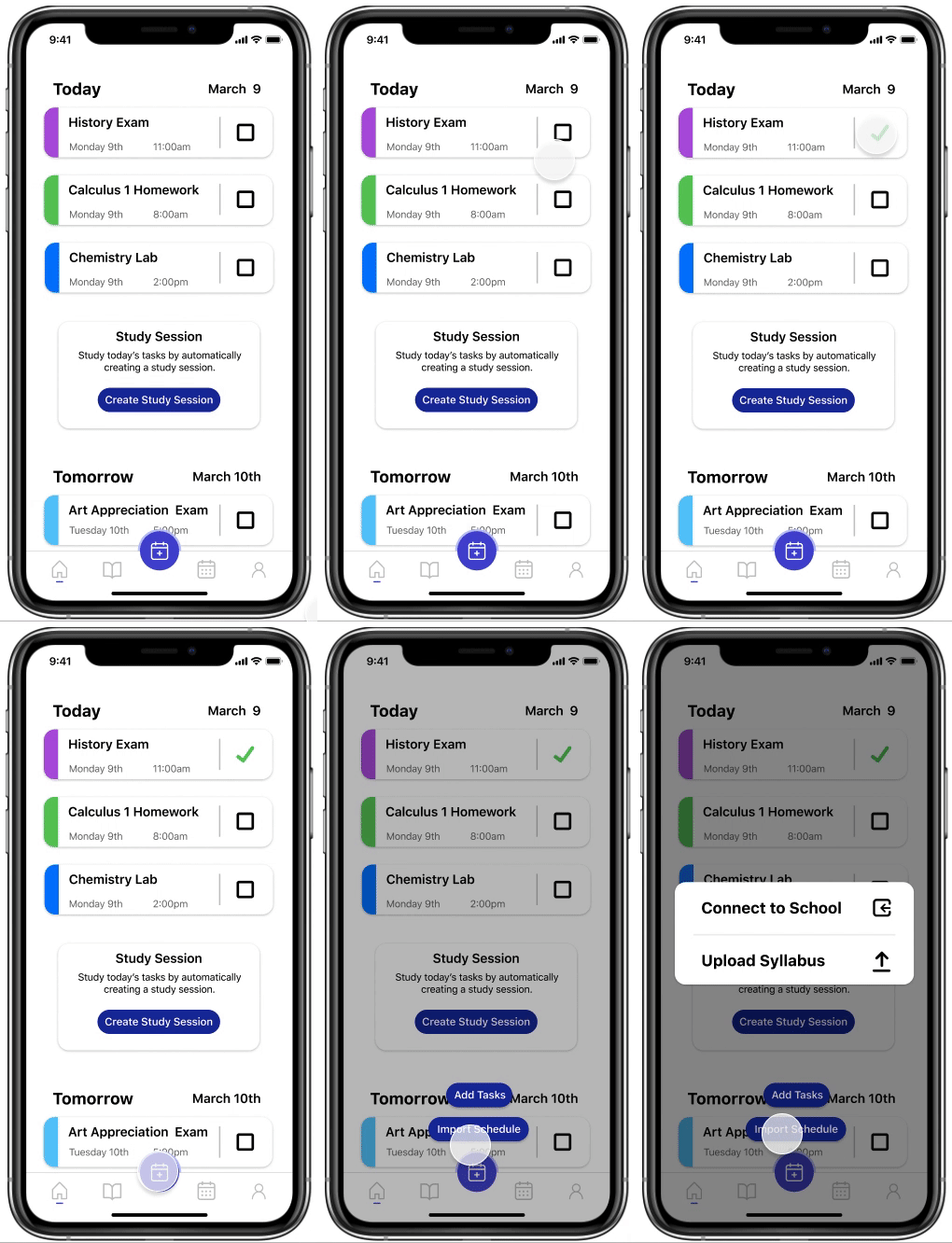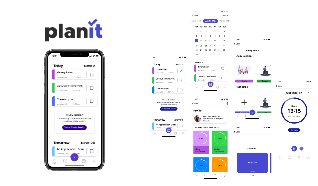

PlanIt is an iOS mobile application for college students who do not use paper planners to stay on top of their tasks and assignments. PlanIt is designed around three main challenges: helping students achieve their academic goals, encourage and simplify the process of staying organized, and reducing the stress of staying on track.
This app was designed using Goal-Directed Design. Using the GDD we are able to start with researching competitive technologies and user behaviors. Once we had an understanding of these, we then identified the user's goals. This allowed us to design for the user and not for ourselves. Using our research we were able to back-up our design decisions. Making wireframing a smooth and swift process.
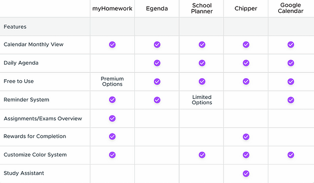
The competitive audit helped us gain a better understanding of features we could consider including in our app, based on successful features in similar apps. I gathered information relative to studying and planing. I researched many apps that are popular and highly rated on the app store. I found Google Calendar, Apple Calendar, and Quizlet.
Google Calendar, Apple Calendar, Quizlet and other similar apps are used by our target audience for a few reasons. One is that they already have it installed on their phone, depending on if they have an Android or iPhone. Another was that it had automation, which means it would integrate with school websites in order to automatically input dates and reminders.
After looking at other apps we used app reviews and found what the users felt the app lacked and what the user praised the app for doing. Compiling all this data allowed my group and I to keep what the user said in mind before jumping into face-to-face user interviews.
Looking at literature reviews allows us to have facts back up or design claims. We can't design something and think that it will help the user, we have to collect data to prove that each design choice we made carried weight. One big topic that my group and I looked at was a term called "Gamification". This term means the application of typical elements of game playing. An example would be a scoring system, achievements, or goals. Adding this element of gamification will help users stay motivated by completing tasks and staying organized.
In order to properly understand who our users are and what their goals are we conducted user interviews. We picked questions that would allow the user to talk about their goals, motivation, and problems with staying organized. Our target audience is college students, therefore, we interviewed college students. We conducted interviews with freshmen, sophomores, juniors, and seniors. The information we gather will help us compile it into a persona.
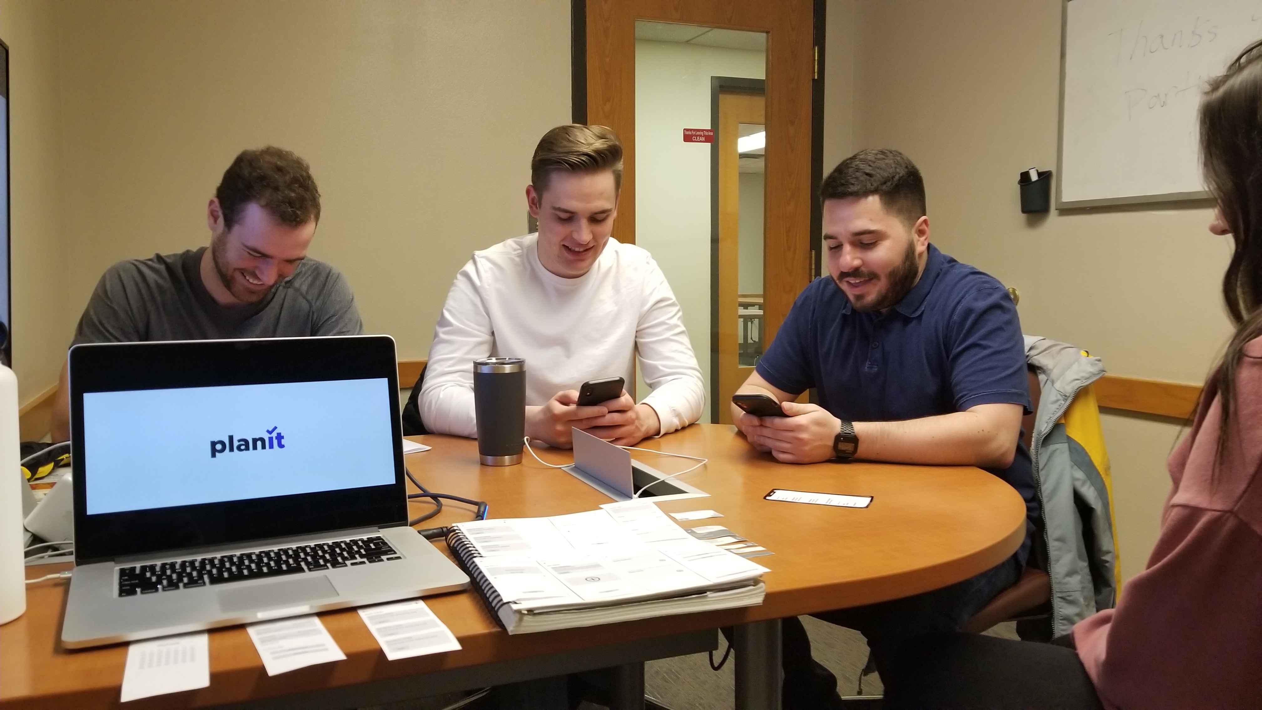
I was in charge of setting up testing and lead the information gathering. This means after the interviews I would lead the conversation about what the user responses were and depict what they said. Making sure the entire group gathered the same data and picked up on anything that was mentioned.
The information that we gathered was what we had expected when it came to organization strategies. Many students either used a calendar app that was preinstalled on their mobile device or they just used syllabuses that they referred back to before class. This enforced the need for integration of other apps or their school website that hosted these syllabuses. Another feature that was introduced was automation. I had a hunch that this feature would be brought up. The students we interviewed voiced their opinion saying that there was no point because they could just refer back to their syllabuses. After digesting this information we had an idea of what features the user desired most when it came to a student planner app.
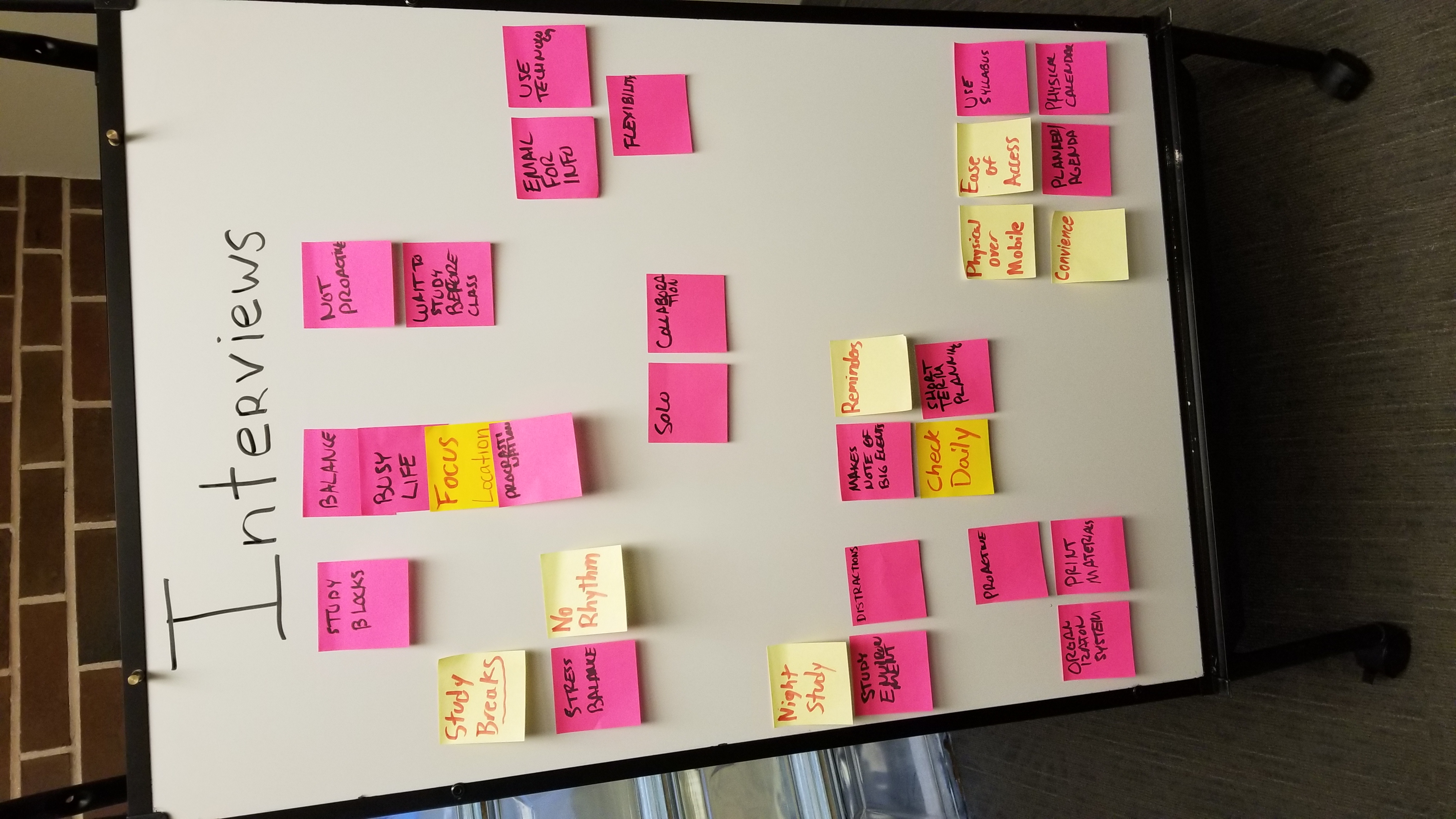
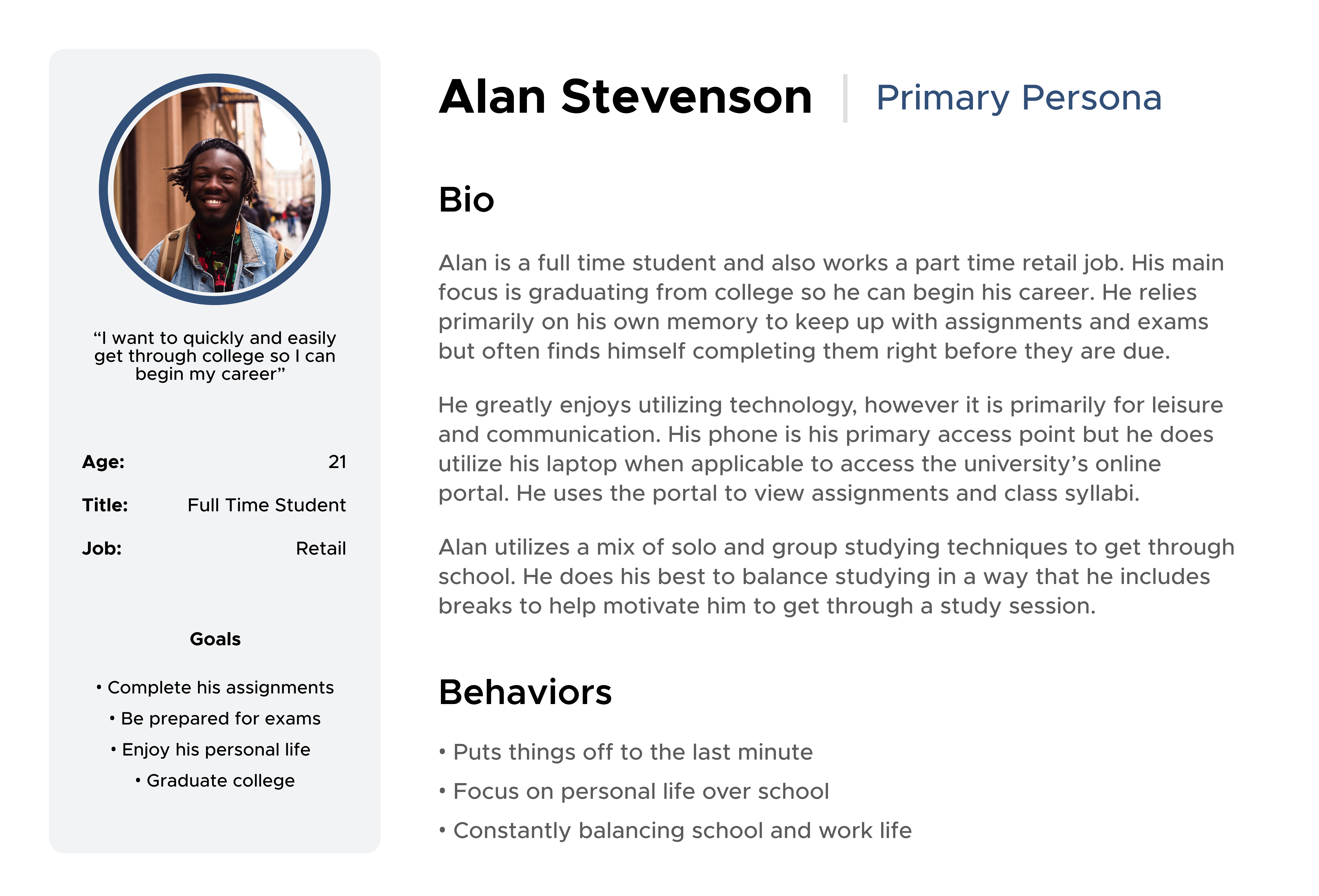
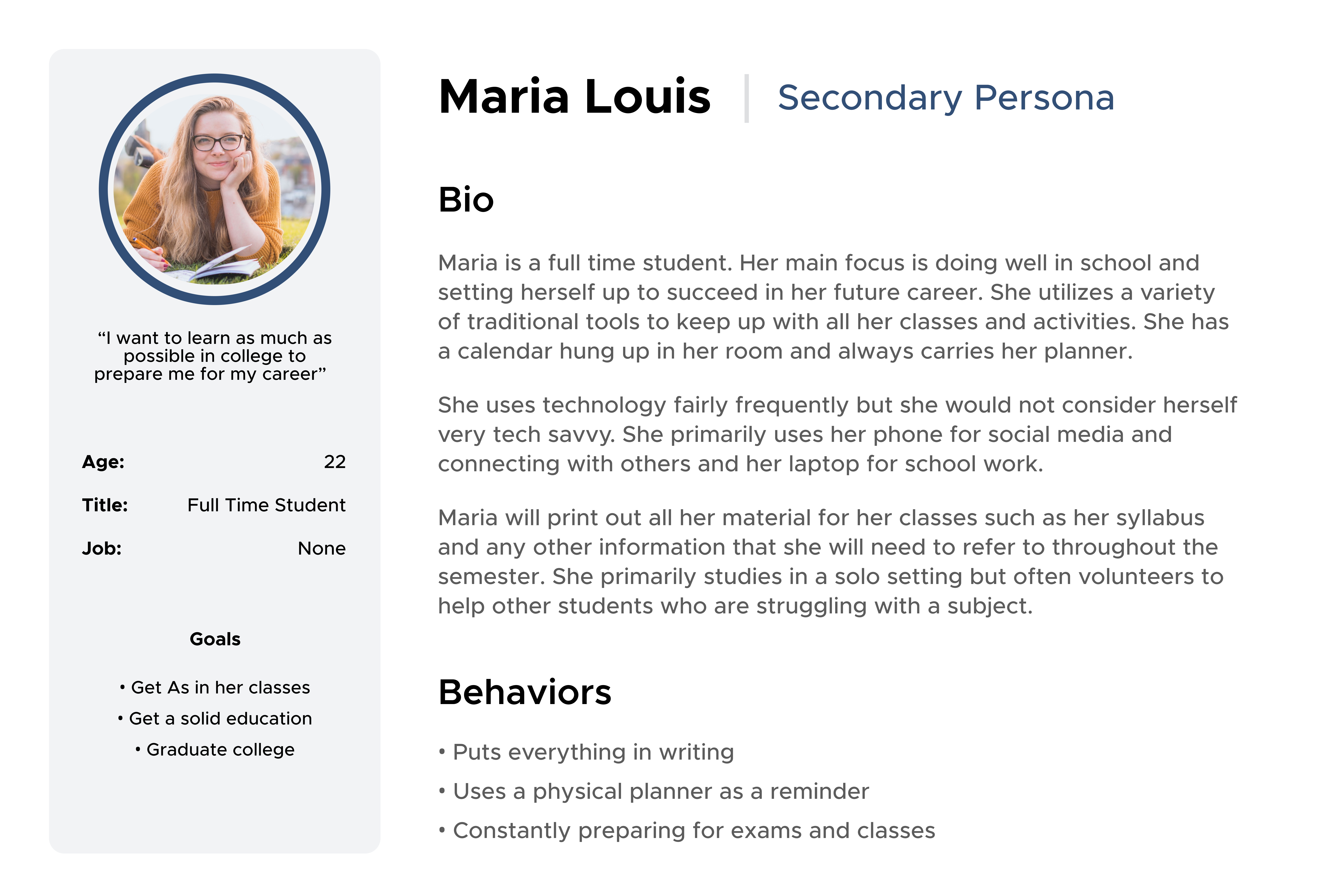
A persona is a representation of the data that was collected from user interviews. In order to accomplish this, we used affinity mapping to identify variables from the interviews. After writing down all the variables we grouped them into two groups, which are career-focused and school-focused. Career-focused users utilized school just to graduate and go into the job market. School-focused users want to take full advantage of school and are focused on learning as much as possible fro their classes.
Once creating our personas we had to next think about what they expected to get out of a planner type app.
Keeping all this in mind while wireframing helped our group to empathize with the user and remember this app isn't for us, but it is for our users.
llustrate how the app was going to look based on our persona. This app had to cater to the persona's needs and wants. Our group came up with this wireframe and following this we jumped into mapping the key path scenario. Once Jordan sketched out some screens we, went onto Figma and made a low-fidelity paper prototype. Using this paper prototype I gathered some users to do user testing. Before we went into paper prototyping, my group and I had to go through the screens to see what the key path scenario was going to be. The keypath scenario is how the user will most often navigate through PlanIt. Our group had to make sure that we had the most talked-about features integrated into the key path. After the key path scenario, using our persona we had to tend to needs that were not in the key path scenario which then these features become our validation scenario.
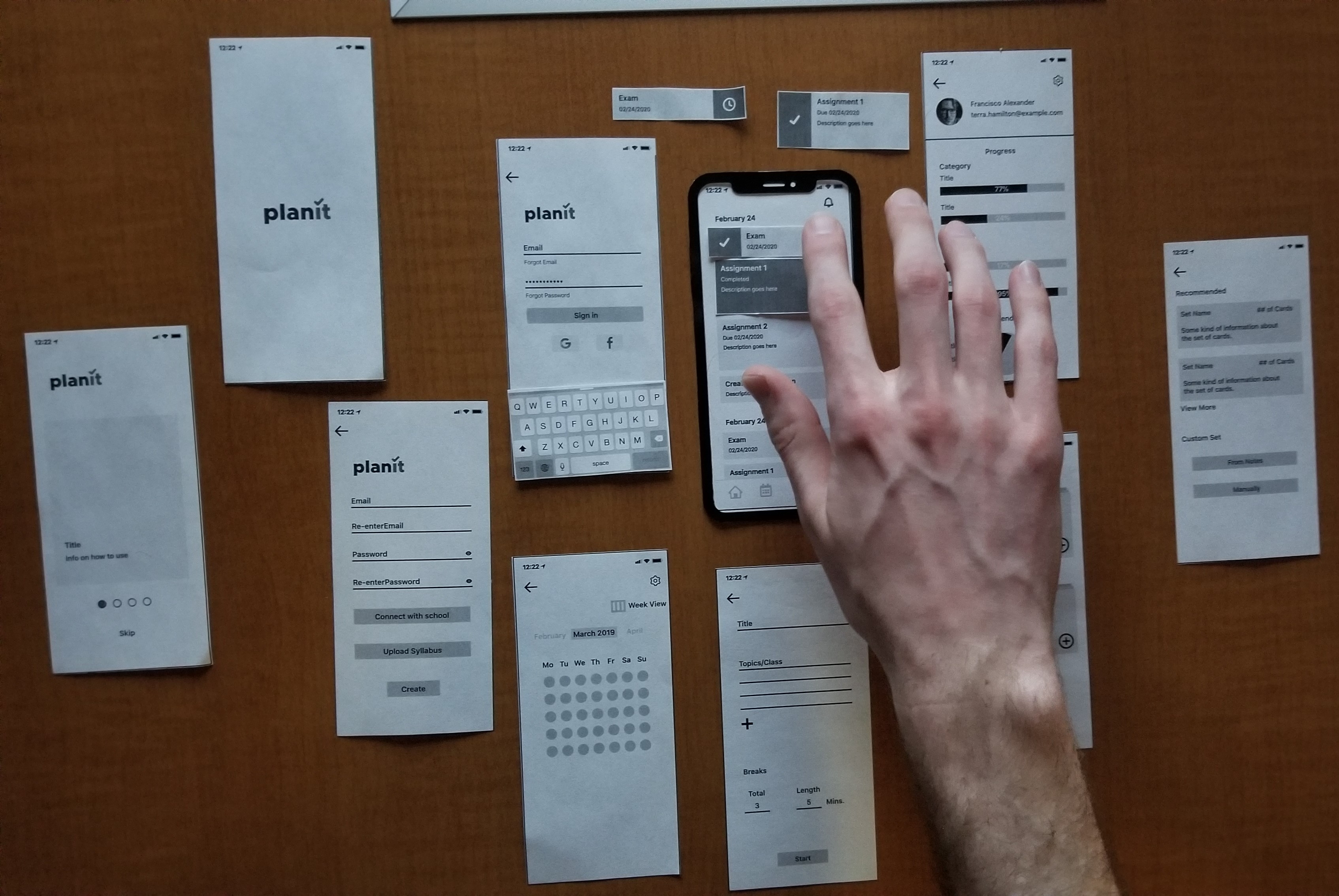
When paper testing users clicked on features and we would lay another piece of paper on top of the other screen to simulate what would happen when an action happens.
llustrate how the app was going to look based on our persona. This app had to cater to the persona's needs and wants. Our group came up with this wireframe and following this we jumped into mapping the key path scenario. Once Jordan sketched out some screens we, went onto Figma and made a low-fidelity paper prototype. Using this paper prototype I gathered some users to do user testing. Before we went into paper prototyping, my group and I had to go through the screens to see what the key path scenario was going to be. The keypath scenario is how the user will most often navigate through PlanIt. Our group had to make sure that we had the most talked-about features integrated into the key path. After the key path scenario, using our persona we had to tend to needs that were not in the key path scenario which then these features become our validation scenario.
After each test, each group member wrote up their notes in a more uniform way. Once we did that we went through them and found key ideas that the user being test said. Doing it this way allowed us to compare what we saw and how the user reacted when asked questions. I focused more on the body language of the user being tested, this way I could record if the user was confused but didn't want to say. I feel that when users are being tested, they sometimes will give answers that sometimes are artificial because they are not comfortable with asking for help.
We gather great data that helped us improve our high fidelity prototype, this includes the size of our button, placement of some features, and allowing users to have forgiveness. Allowing the user to have forgiveness is when a user clicks the wrong area to find a feature, but it is there so if they do accidentally click it they will not become confused. An example in PlanIt was the "create study session" feature which is in multiple places around the app. This way users will always be able to create a study session. The placement of some features were in confusing areas, for example, we had a notification button on the home screen. This feature was to manage notifications which we ended up putting in the settings on the profile page. Lastly, when testing users had a hard time clicking the buttons because they were small due to Figma's prototyping function. The group and I had to go back and add a transparent box so the button its self was a clickable size.
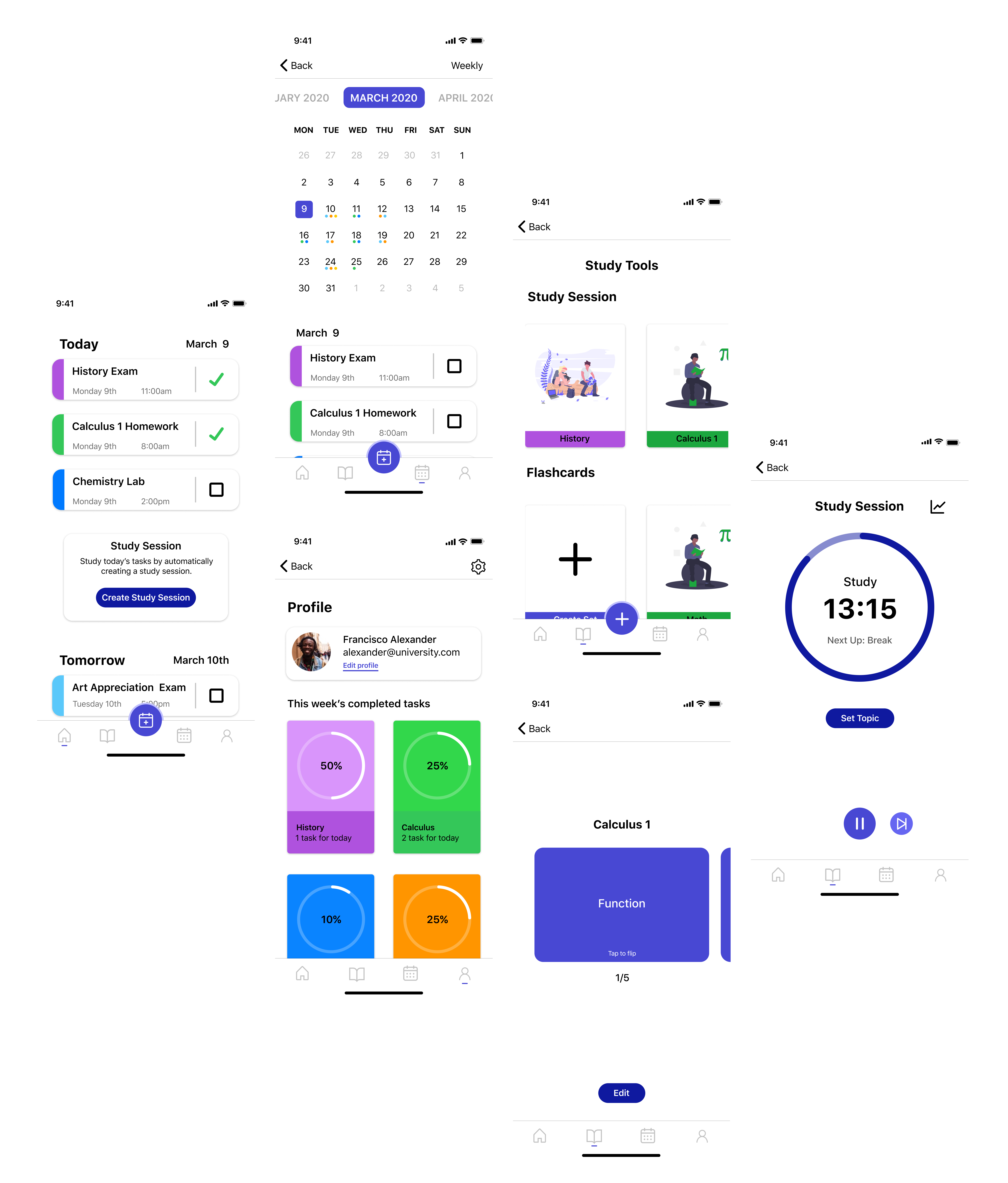
One of the biggest takeaways is how much more I learned about goal-directed design. This is not my first time using it, so by now, I am very comfortable applying this method to any interface design project that will come my way. Another big one is working remotely towards the end of the project, which I have never done before on a project of this caliber. I think that a constant form of communication helped my group and I work through this.
Something I can take away about planner apps is in order to help your user stay organized, you have to create a simple and organized app. At the same time, you have to tend to the needs of your user, which might mean the user requires many different features.
